

New Villa Crest Insights, Kit Inflation Backfire and Incoming New Sponsor?
AVWTF8

Greetings,
Trust you are well.
Welcome to you latest dose of proper Aston Villa news and insight directly into your inbox.
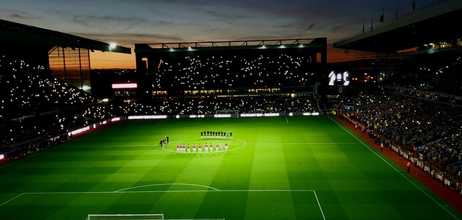
A decent return from Villa’s the last two games - both at Villa Park - now makes the international break bearable and hopefully lays the foundations for further improvement in October. The upcoming six games in that month will undoubtedly play a significant role in defining what type of season Villa will have.
While the injuries to the club’s two main new signings, Diego Carlos and Boubacar Kamara, are a concern, if the likes of Coutinho, Buendia, Bailey, Luiz, McGinn, Watkins, Ings, Mings and Konsa all improve on their offerings of last season, then we should still see improvement.
Despite the injuries, the buck rests with Steven Gerrard and his coaching staff, as there’s still enough talent to choose from, so let’s see what October brings.
Meanwhile, let's shift our focus to three off-the-pitch issues.
New Crest Design
A few weeks ago, I attended a Villa Fan Consultation Group meeting focused on the new Villa Crest and overall aesthetic of Aston Villa’s future branding. Also present at the meeting was a designer from a London-based agency who will be working on the project.
As you may recall, a couple of days prior to the meeting, the club had released a survey for supporters to provide their input on the design (which you probably participated in). Personally, I found that survey, wasn’t set up to gather the constructive information it sought to collect, as it funnelled the aspirations of supporters into token marketing buzz words like ‘fun’, ‘energetic’, ‘premium’, which ultimately aren’t too useful in informing the process.
Furthermore, asking fans to choose their favorite badge from rival Premier League and Championship clubs, where tribal influences could potentially affect judgment, was a somewhat limited exercise.
It’s worth pointing out that the Fan Consultation Group had expected for the ‘consultation’ process to begin with the survey, but that was publicly released before any input could be given.
However, the actual meeting itself proved to be much more constructive and substantive. I was pleasantly surprised to find that other FCG members were open-minded regarding the approach to the crest design and there was plenty of constructive debate.
Like many Villa supporters (including those at the meeting), I have a strong fondness for the round badge from the 1980s, which was used between 1974 and 1992. It was my first Villa badge and symbolises a golden age for Villa, when they achieved their greatest success. In my opinion, it surpasses any badge that came after it.
However, it's important for the club not to dwell on the past or be trapped in stagnant fan sentiment or lazy nostalgia. While those at the meeting were also advocates for the round badge, they largely shared the view that the club should explore every possibility and adopt a ‘green hat’ approach to revaluate core elements and be open to fresh concepts and ideas.
Personally, I stressed that merely designing a badge that sought to please as many fans as possible (and avoid a potential backlash on Twitter) would result in a run of the mill, generic and conservative design.
To give you an idea of some of the key things that were discussed, lets start with the obvious approach to appease the social media masses…
Take the current lion with a star, throw it into a round badge and swap AVFC with ‘Aston Villa Football Club’ in a modern font. That would pretty much be considered job done.
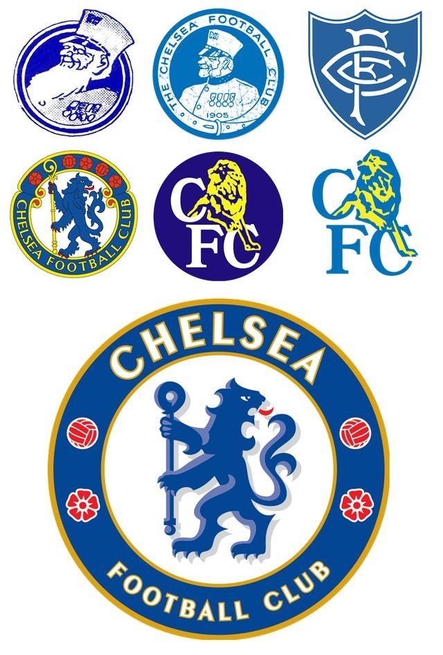
However, I believe this is a lazy approach that would result in a badge resembling the current direction taken by clubs such as Chelsea, Manchester City, Brentford, Brighton et al. In fact, it could potentially bear too much resemblance to Chelsea’s latest design.
Wouldn’t this be wasting an opportunity to set Villa apart from other clubs?
After all, one of the motivations for the new badge was to attract potential new overseas Villans.
Star Thoughts
During the meeting, there was an interesting debate regarding the inclusion of a star within the badge. One person suggested it was expendable, implying that it should not define us. They argued that immortalising the star within the badge suggested a lack of aspiration and the belief that such achievements would never be attained again.
Furthermore, throw in the fact that the likes of Nottingham Forest and Chelsea have won it twice, also makes Villa look a little small time.
There was a suggestion that the star should only be displayed on the shirt, either above or below the badge, when Villa participates in European competitions. This line of thinking has its merits.
Personally, I have shifted my viewpoint from considering the star as an essential element within the badge. I now prefer the idea that it should be used outside the badge. After all, if/when Villa do win another Champions League, then you’ll need another new badge.
As it stands, I prefer the away shirt badge, when the star is the same claret colour as the lion. On the home badge, the white star alongside a yellow lion gives the impression that the lion is following the star of Bethlehem.
Speaking of the lion, I am not a fan of the yellow color. In principle, it should be claret to enhance visibility and make it more visually appealing.
Lion
When it comes to capturing the essence of the club's history and origins, the rampaging lion, with its Scottish heritage, stands as a key and singular element. However, I would argue that Aston Villa has yet to find a lion representation in any of their badges that is truly satisfactory and definitive.
Does the current lion emblem truly resemble a "rampaging lion"? Does it exude fearlessness or pride?
I’d argue it could be improved.
Interestingly, in this regard, it often doesn't take much to alter the perception and appearance of a badge. Take, for example, the redesigned Tottenham Hotspur badge shown below.
During the meeting, I jokingly mentioned the cockerel in Spurs’ previous badge looked like a depressed chicken. In reality, all the designer literally did was adjust the bird’s posture by puffing out its chest, and it dramatically transforms the feel and message conveyed by the badge.
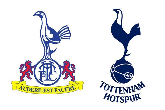
With its posture adjusted, the Spurs cockerel now looks a lot more proud and distinguished.
Maybe a small tweak or two on Villa’s lion is all that is needed?
As previously mentioned, if there is to be a lion, it has to be claret to connect it to the club and to be used out of a badge context (more of that later).
Aston Villa vs AVFC
The prevailing sentiment at the meeting was largely that if you’ve got one of the best and most unique names in English football, then it should be on the crest, rather than using a hashtag-like abbreviated form that significantly undermines the club's image. This viewpoint appears to align with the feedback received from the club's fan survey as well.
However, if we are considering all possibilities in this design process, it may be worth exploring an option that departs from both the lion symbol and the club name entirely.
Let’s get minimalist…
A & V
One avenue I thought was definitely worth exploring was to look at the possibilities of what could be done utilising the letters A & V. From a design perspective, these letters possess great aesthetic qualities and an inherent symmetry when combined. They are iconic across the Villa spectrum - from the former unique and fabulous A & V floodlights to younger Villa fans making A and V signs with their fingers in social media pictures.
Perhaps the A and V may be underutilised in Villa's current branding?
There are various possibilities for incorporating them in inventive ways within the actual crest, ala Borussia Dortmund, Juventus, or Fulham. Alternatively, creating a personalised typography with a focus on the A & V could be explored to enhance the overall branding of the club.
Another approach could be to use the A & V as a frame for the badge, with the lion positioned in the middle, an A shape on top, and a V shape below.
It's important to avoid overcomplicating the badge and attempting to include too many symbolic gestures. Sometimes, a minimalist approach can be more impactful and meaningful.
Moving Elements
That being said, if the design team can create an improved lion design, it would open up more dynamic options for the overall design.
Take Liverpool and Spurs as examples, where their shirts feature a key element from their crests rather than the full club crest. Spurs use their cockerel, while Liverpool showcases the Liver bird. This approach not only looks visually appealing but also allows the key element of the club's identity to be utilised in a more dynamic fashion as a logo on shirts, rather than as a traditional crest.
The crest itself can be reserved for other purposes such as the stadium, gates, letterhead paper, and badges.
Additionally, why not get creative with the third kit? Incorporating the new lion into old-style badges from Villa's history could be a unique approach, making important elements adaptable to Villa's branding. For example, on the anniversary of winning the European Cup, the third kit could feature the round badge. Similarly, on the anniversary of the club's founding, the first-ever Villa badge could be used. There are numerous possibilities to make third kits more significant and meaningful.
I will be attending a follow-up Fan Consultation Group meeting this week to potentially view some early designs, so I’ll update you accordingly.
New Sponsor Ahead?
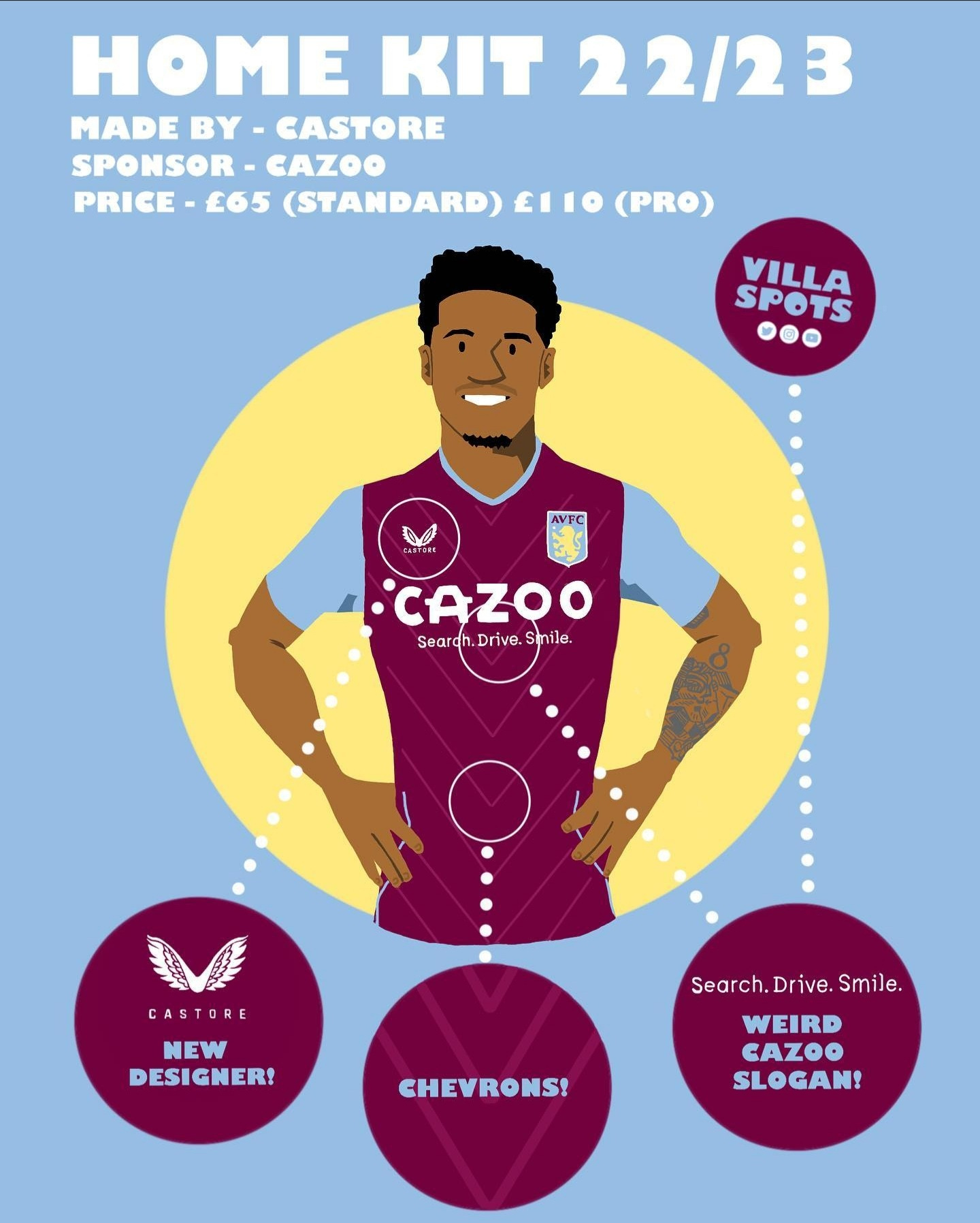
After a strategic review of their European operations, Cazoo, Aston Villa’s current shirt sponsors, have announced they are proposing to "‘wind down operations in mainland Europe to focus on core UK market’.
The company had earlier this year announced cutting 15% of its workforce (thought to be 750 jobs) in an attempt to save them £200m. Plus, after sponsoring Everton for two-years, they were unable to negotiate an acceptable extension to that deal.
Cazoo’s withdrawal from the EU market is ultimately motivated by further cost-cutting and downsizing. It will remove the need to potentially overextend themselves in propping up European operations with further funding. It is estimated to result in net savings of £100m by the end of next year. With a focus on cash preservation during a difficult macro-economic backdrop, boosted by record UK revenues, the Company is now expecting to breakeven by the end of 2023.
You’d expect them to potentially retreat from the expensive practice of football team shirt sponsorship (Villa are reported to obtain circa £6m-a-season), after an outlay of millions across several European football clubs.
So, all roads seem to lead to a new Villa shirt sponsor next season.
Speaking of shirts…
Early Shirt Sales
The normal Aston Villa shirt price of £65 had seen a head-shaking 14% price increase on last season. I discussed in an earlier myoldmansaid article how Aston Villa shirt prices stacked up against the rest of the Premier League. Only Spurs (£115) and Chelsea (£114.95) charged more than Villa (£110) for a pro-fit version of their shirt.
Interestingly, since the 2022/23 season kicked off, Villa supporters only had to wait a matter of weeks before shirts were being offered up at substantial discount prices of 25% off.
Now, Fanatics control sales offers and obviously have well-oiled price reduction formulas to shift stock levels, so are these earlier than normal sales, an indication that perhaps the club got the initial pricing wrong?
UTV
For further discussion on Villa, follow and listen to the My Old Man Said podcast
Follow me on Twitter - @myoldmansaid
Support the work and join the inner circle
Great piece David and totally hear you on the badge designs. It seems tempting to perhaps throw all sorts of nostalgic or historical elements to the badge but with danger of it being too complicated and losing the message or impact. I love what Spurs have done with their badge, a lesson in modern branding. Look how powerful the Arsenal cannon looks on its own. If we can make it simple and stylish yet instantly recognizable then we’re on onto a winner.